Giant Conf Denise Jacobs

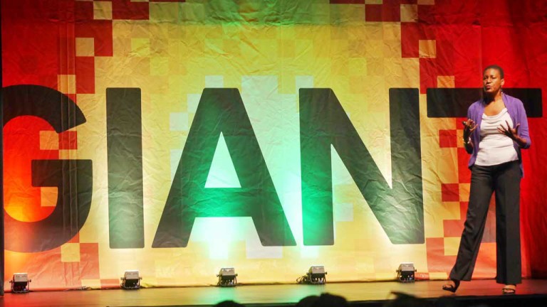
Giant Conf 2015: My Day One Session Notes

Giant Conf is a design/UX conference held in Charleston, SC. It was pretty exciting to see it come out of nowhere, but still able to pull in an impressive roster of speakers in its debut year in 2014. I was there to experience it just a few months after I went to Austin for SXSW.

SXSW is an example of a conference that’s grown too big to be easily enjoyed without a ton of planning and fatigue. You have to meticulously plan out your days to make the most of it. You have to physically prepare for lots of walking around and standing in line to get into sessions. There’s also the stress of worrying that you might not get into the session you stood in line for an hour for. On average, I saw about 4 sessions a day.

With Giant on the other hand, I was able to roll into the Charleston Music Hall in the morning. Grab a free coffee and breakfast pastries, sit in the beautiful theater and listen to top draw speakers such as Aaron Draplin, Ethan Marcotte, and Jared Spool. With only 3 venues, each within a few minutes walking distance, I was able to get about 6-7 sessions a day.

Anyway…I was meaning to write about Giant last year, but life happened. One year later, I’m back at Giant Conf 2015, and this time I’m determined to get something written here. So here are my edited notes from the first 3 sessions from day one: Continue reading
TourToEnable-AboutUs

5 things nonprofit organizations need to have on their About Us page

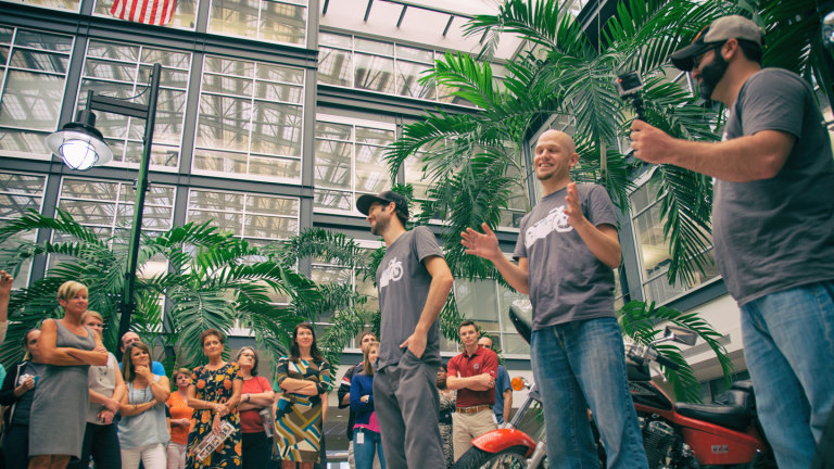
I just spent the last week at BBCON 2014, where I had the privilege of speaking with a ton of different nonprofit organizations about their websites and online strategy. With each nonprofit that I spoke to, I needed to find out the basic information about them. Since I was face to face with the people who work for the nonprofit, I gathered this information in conversation. I was able to hear directly from them about who they were, what they did, how they do it, etc. Most importantly, I got to experience their passion for the cause and why what they do is so important to the world.

Most donors won’t have the opportunity to speak face to face with the organization; to hear about them and see their passion first hand. They will rely on the organization’s website to give them the necessary information. I came across a common theme at BBCON, not many of the websites I went to did a good job of telling potential donors about their organization and making them care enough to want to support their mission. This is where the About Us page has an important role.

No matter how well established the nonprofit organization is, it still needs to tell the new visitors who they are, what they do, and most importantly why they do what they do.  The About Us page is where new visitors will turn to when deciding if they want to have a deeper relationship with the organization. These things are important to communicate on the Homepage, but the Homepage has too many other things to do to be able to do a good job of convincing a potential donor that the organization and its cause is worthy of their hard earned cash.

There are 5 things that I believe a nonprofit organization must have on their About Us page:

  1. The mission statement
  2. What they do
  3. How they do it
  4. The impact they have
  5. Who they are

I started writing about each of these 5 things in detail for this blog post, but it became too long. So instead I’ll cover each one in a separate post, starting with writing the mission statement.

Continue reading